Sports

American Sports’ Top Beloved and Despised Uniforms

Darren - September 11, 2020
Sports

American Sports’ Top Beloved and Despised Uniforms

Darren - September 11, 2020

Successful sports teams make their uniforms iconic. Fans go crazy for their team’s colors and will buy new merchandise every season. It’s an essential way for a team to bring in revenue, yet a bad uniform can be very damaging. However, not every team has a great one.

Sports teams make some risky moves, but uniform decisions can be one of the biggest. Today we’re going to take a look at 40 beautiful and terrible uniforms in US sports leagues. Some are stunning and iconic, while others just make you want to shake your head. Check out the list below via Yardbreaker.

Mandatory Credit: USA TODAY Sports

40. Bad – Tampa Bay Buccaneers

The Bucs won the Super Bowl in 2021 and sealed a whole bunch of records in the process. First of all, they were the first franchise to win the coveted prize in their home stadium. Meanwhile, Tom Brady won his seventh ring and ensured that he had more than any NFL franchise managed in their history. All of that is great, but the Bucs don’t actually wear nice uniforms.

Mandatory Credit: USA TODAY Sports

Tampa combines black, white, red, and orange to a mixed effect. The problem is all about the shades that they used. Nobody looks at the Florida franchise’s uniforms and thinks that they stand out. There is just something very generic about them. However, their creamsicle throwback uniforms are something truly unique and should replace their modern look for good.

Mandatory Credit: USA TODAY Sports

39. Great – Green Bay Packers

There is a lot to like about the Green Bay Packers. First of all, they’re the only NFL franchise without a billionaire owner. Naturally, their fans feel like they have the moral high ground because of this. However, another thing that they have in their favor is one of the sports’ classic uniforms. Their green, yellow and white combination is one of the NFL’s most iconic looks.

Mandatory Credit: USA TODAY Sports

It may come as a surprise to many that before 1950, the Packers wore navy blue and gold because their founder was a Notre Dame alumnus. However, they eventually replaced the blue with their legendary kelly-green and haven’t looked back since. When it comes to green it’s all about finding the right shade. The Packers’ choice is far superior to the Jets’ ‘Gang Green’ mess.

Mandatory Credit: USA TODAY Sports

38. Bad- Inter Miami

Inter Miami made their MLS debut in 2020. Many fans were excited to see David Beckham’s expansion franchise in action because of his association with the league. Furthermore, they were curious about what color block they would use for their uniforms. However, Miami arguably lost fans before they even kicked a ball because of their terrible marketing effort. Pink, black, and white just doesn’t work well.

Mandatory Credit: Bleacher Report

That was the color block that they went for but they didn’t pull it off very well. We’re not sure how many elderly Florida natives will want to jump on board this train but who knows? The shade of pink that they chose initially was also disappointing. It was almost more of an off-white which made it look like one of the weakest uniforms in sports. At the very least own a shocking pink and stand out on the field.

Mandatory Credit: USA TODAY Sports

37. Great – Oklahoma Sooners

So many teams across the world use red as the primary color for their uniforms. Traditionally associated with danger and fire, many franchises use it because they want to strike fear into the hearts of their opponents. However, it doesn’t always work. The correct shade is important because otherwise, the uniforms look dated or drab. In this regard, the Oklahoma Sooners pull off their uniforms better than most NFL teams.

Mandatory Credit: USA TODAY Sports

The Sooners utilize a classic red-and-white color block to magnificent effect. Officially branded as crimson and cream, they are truly vibrant and stand out on the playing field. Meanwhile, their logos are in perfect harmony with the rest of their uniforms. An honorable mention goes to the Alabama Crimson Tide, but the Sooners rock red better than almost any other football team out there.

Mandatory Credit: USA TODAY Sports

36. Bad – Cleveland Browns

The Browns kick off this list because their uniforms really aren’t great. We do give them credit for trying something different. But the problem is that brown just isn’t a statement color. It’s really difficult to look at them and not shrug your shoulders because they just aren’t eye-catching.

Mandatory Credit: USA TODAY Sports

Furthermore, their logo really doesn’t help matters. Literally, just a football helmet, the good people of Cleveland deserve more. In fact, you could argue that the team needs a total rebranding. What is a ‘Brown’ anyway? We could wiki it, but let’s be real here, nobody cares.

Mandatory Credit: USA TODAY Sports

35. Great – Pittsburgh Steelers

We’re trying not to allow nostalgia to make us biased. There are a few classic uniforms on this list and they’re all great designs. A case in point is the Steelers’ beautiful black and gold combination. Overall the two colors just work so well together that it’s impossible to keep them off this list.

Mandatory Credit: USA TODAY Sports

While they’re not the only team in the league with this color scheme – more on that later – it’s still distinctive. That’s because of the shade of gold. It’s warmer than the likes of the 49ers or the Saints, giving them a uniquely bright appearance. This is definitely a winner.

Mandatory Credit: USA TODAY Sports

34. Bad – Los Angeles Kings

Black is one of the most effective uniform colors because it often provides a clean and clinical look to a team. However, it’s even possible to get this wrong. In sum, the Kings managed to achieve this with their soulless, boring design. It literally looks like somebody just stenciled a logo on black shirts.

Mandatory Credit: NHL

There is no getting around the fact that their uniforms are bland. This is unforgivable in hockey because they typically have a combination of colors. They fail to make them endearing in any way. If you use black you want people to think it looks cool. A little bit of inspiration wouldn’t go amiss here.

Mandatory Credit: USA TODAY Sports

33. Great – San Francisco 49ers

There aren’t many red uniforms on this list because there aren’t many great ones out there. For example, the Kansas City Chiefs have a great team but their uniforms are pretty dull. You could say the same about the Buccaneers and the Falcons. But the 49ers buck this trend.

Mandatory Credit: USA TODAY Sports

It’s all about the combination. Red and white are often bland, but substitute the latter for gold and you have something brilliant. That’s what the 49ers did and it was an inspired decision. They’re extremely classy and vibrant while giving their team an iconic look on the playing field.

Mandatory Credit: USA TODAY Sports

32. Bad – Charlotte Hornets

The first basketball team on this list unfortunately has one of the worst uniforms in the country. Teal is one of those marmite colors in sports. However, it really depends on how you wear it. Anything brighter than the Miami Dolphins’ aqua blue is dangerous territory – but at least they have their orange and white contrast to create a striking look.

Mandatory Credit: USA TODAY Sports

The Dolphins’ uniform works, but the Hornets’ doesn’t. It’s just far too garish. You can almost feel the UV rays bouncing off of it. Meanwhile, their logo isn’t particularly great either. Overall, this team needs a redesign because there is just way too much going on.

Mandatory Credit: Bleacher Report

31. Great – Boston Red Sox

One of the most iconic uniforms in all sports, the Red Sox do everything right. First of all, let’s talk about the obvious part. Their red socks are the most famous in MLB and probably every sports league on the planet. But it’s the overall look that makes this uniform so successful.

Mandatory Credit: Bleacher Report

At the end of the day, fans want to buy and wear their team’s jersey. The majority of baseball designs are relatively simplistic but you don’t want them to be busy. It’s all about the right font for your team name and ensuring that the details look clean and defined. They definitely pull it off.

Mandatory Credit: USA TODAY Sports

30. Bad – Maryland Terrapins

There is simply no excuse for the Maryland Terrapins and their atrocious uniforms. They are a successful college program but we wonder if that’s because they blinded their opponents with their ugliness. In short, they are just too busy. The Terrapins base their color block on the state flag of Maryland, but it simply doesn’t work. It’s an eyesore and they should be shut down for it.

Mandatory Credit: USA TODAY Sports

First of all, let’s talk about those helmets. The best football helmets have no more than two colors and either numbers or a tasteful logo on the sides. But the Terrapins didn’t receive the memo because they look like somebody let a child loose with a paintbrush. Some teams immediately create an aura when they step out onto the field because of their iconic uniforms. But the Terrapins won’t win any design awards.

Mandatory Credit: USA TODAY Sports

29. Great – Chicago Bulls

Sometimes one man can make a difference. The Chicago Bulls are synonymous with Michael Jordan. ‘M.J’ made the NBA go global and also ensured that the Bulls’ all-red color block is one of the most iconic in all of the sports. Only the Bulls use this scheme in basketball and it ensures that they stand out on the court. Of course, their golden era was in the 1990s, but it’s still a magnificent look.

Mandatory Credit: USA TODAY Sports

Before 1985, the Bulls wore white as their home uniform and red as their away. However, they made the right decision in swapping the two around. Meanwhile, their bull’s head logo is also legendary and remarkably remains the same since its creation. Sadly, Chicago declined as a franchise over the years, but their history helps to make this one of the greatest uniforms in basketball.

Mandatory Credit: Bleacher Report

28. Bad – Arizona Cardinals

Why do the Cardinals have an ‘Angry Birds’ logo on their helmet? If you’re a fan you’ll probably defend it until your last breath, but to the majority of people, it looks goofy. Could they do something with this to make it look a little bit more intimidating or powerful? We think so. Just look at the Atlanta Falcons.

Mandatory Credit: USA TODAY Sports

Meanwhile, the red-and-white color combination is okay. But if you use red then there needs to be something special about it. Red is such an overused color that it’s difficult to stand out. There is just nothing special about the Cardinals’ designs at all. Nobody wants to be mediocre.

Mandatory Credit: USA TODAY Sports

27. Great – Winnipeg Jets

One of the best hockey uniforms out there, the Jets combine all the most important features that you expect to see. First of all, they have a great badge, with the maple leaf/airplane combo. Some hockey badges are way too busy, but the Jets unis implement a very balanced look. Meanwhile, the aviation wings on the shoulders are a classy touch.

Mandatory Credit: USA TSN

Furthermore, their colors are so slick. Their navy, white, and baby-blue are very clean and combines together so well. It’s in stark contrast to the dull black/grey of the Los Angeles Kings. To sum up, the Jets do everything right and have one of the most underrated uniforms in sports.

Mandatory Credit: USA TODAY Sports

26. Bad – Arizona Diamondbacks

The Diamondbacks just can’t seem to get it right. After a disastrous number of years, they’ve come up with yet another look. This time they’ve incorporated red and black into their design. But let’s be real, it doesn’t really work. There is nothing unique or distinctive about it.

Mandatory Credit: Bleacher Report

At least when they used purple, it stood out. Even though it wasn’t the cleanest look, they tried. This is just a step sideways into something drabber than before. Meanwhile, the whole ‘D-Backs’ thing is dreadful. To sum up, they should have kept their World Series color scheme.

Mandatory Credit: USA TODAY Sports

25. Great – Portland Timbers

All the good things that we said about the Green Bay Packers can be repeated about the Portland Timbers. The Timbers are one of the most popular MLS franchises out there. Unlike most MLS teams, they boast a genuinely passionate group of supporters and have a massive waiting list for season tickets. Meanwhile, they also have one of the standout uniforms in the league.

Mandatory Credit: USA TODAY Sports

Green and yellow work very well together as a color block. The two make for a very vibrant and recognizable combination because not many teams go for it. As a result, the teams that use it become instantly memorable. Furthermore, the Timbers also have a great badge. Who doesn’t love an ax? If every MLS franchise was as fun as the Timbers, the MLS would be one of the best soccer leagues in the world.

Mandatory Credit: USA TODAY Sports

24. Bad – Wyoming Cowboys

Oh dear, there is just nothing good to say about this. We already spoke about how brown is generally not a good look for sports uniforms. However, even Cleveland’s uniforms are better than the Cowboys’ grim ensemble. They combine muddy brown with mustard for one of the worst color blocks that we have ever seen. How anybody thought that this was a good idea is beyond belief.

Mandatory Credit: USA TODAY Sports

The one positive thing that we can say is that they tried something different and wanted to remind everybody of Wyoming’s rural traditions. That’s understandable but they could have gone for literally any other color block and it would have been better. The Mountain West team is improving though so expect to see more of these eyesores in the future. Unfortunately.

Mandatory Credit: USA TODAY Sports

23. Great – Las Vegas Raiders

The Raiders have an extraordinary uniform. It’s so defining that no other franchise in the NFL could ever use it because it’s quite simply just theirs. Black and silver is a phenomenal combination that stands out whenever their players step onto the field.

Mandatory Credit: Sports Illustrated

Meanwhile, their logo is one of the most fearsome in the sport. Their colors have helped to produce one of the most vibrant fanbases in the entire NFL. When their fans gather in one place it’s incredibly intimidating. Being different can definitely win you points when it comes to the best uniforms.

Mandatory Credit: USA TODAY Sports

22. Bad – New York Jets

Green is a tricky color to pull off. If it’s the wrong shade then your team will just fade into the grass. However, the right shade can be extremely appealing. But the Jets’ bottle green jerseys and white combination are one of the murkiest and least effective in the entire NFL.

Mandatory Credit: USA TODAY Sports

It also looks extremely dated. Their font looks like a hangover from the ’90s and not in a good way. They really should update that at the very least because it’s a very dreary style. If your team isn’t performing well on the field then you should at least make them look good.

Mandatory Credit: USA TODAY Sports

21. Great – Memphis Grizzlies

Some people will hate the inclusion of Memphis on this list but we think they are doing some great things with their uniforms. Their pastel blue statement uniform was very effective in contrast to the typical royal blue that most teams favor. Meanwhile, they came up with some other great designs.

Mandatory Credit: USA TODAY Sports

We’re focusing on teams’ home uniforms as much as we can, but the Grizzlies wore a medley in 2019/20. Their Vancouver classic kit was an example of how to successfully pull off teal. It was a very fun design that looked great on the court. Charlotte should take that as an example.

Mandatory Credit: USA TODAY Sports

20. Bad – Detroit Pistons

The Pistons have had some outstanding uniforms throughout the years. We think of the ‘Bad Boys’ era and how they made the red and blue famous. Then they very controversially turned to teal for a few years. However, the current era is less inspired than before.

Mandatory Credit: USA TODAY Sports

It’s not that their current era of kits are that bad. But there is no denying they’re very functional in their design. They don’t take any risks and the team lacks the success on the court to endear these uniforms to their fans. Let’s hope they begin to innovate again in the near future.

Mandatory Credit: Bleacher Report

19. Great – Vegas Golden Knights

Not many hockey teams successfully pull off a clean look, but the Golden Knights definitely do. They narrowly beat the New York Rangers and the Detroit Red Wings to this list. The Los Angeles Kings could learn a thing or two about minimalism from Nevada.

Mandatory Credit: USA TODAY Sports

Charcoal is a very brave color to choose because if it doesn’t work it’s so dull. But it serves as the perfect backdrop to their golden helmet insignia. Meanwhile, they tastefully worked red and black into their sleeves. This is a luxurious hockey uniform from a growing franchise.

Mandatory Credit: USA TODAY Sports

18. Bad – Houston Texans

The Texans’ uniform isn’t that bad really on the surface. The problem is their clear similarity to the New England Patriots. Ok, they have different color helmets, but their jerseys are too much like those of a way more successful side. It makes them seem like a tribute act.

Mandatory Credit: USA TODAY Sports

Meanwhile, Houston isn’t a cattle town. They’re an oil town and that’s a sore point for many locals who still struggle to identify with the new franchise. The Texans might be 18 years old but the legacy of the Oilers still hangs heavy in the Lone Star State’s most populated city.

Mandatory Credit: USA TODAY Sports

17. Great – Oakland Athletics

One of the classiest baseball uniforms out there, the Athletics have a beautiful look. Their use of kelly green is outstanding. Green can be very difficult to pull off but when it works, it’s extremely classy. The Athletics have one of the best in MLB.

Mandatory Credit: USA TODAY Sports

The uniform ticks all of the boxes because they have a unique color scheme that also looks good. Sometimes teams try too hard and their uniforms are too busy or garish. The Athletics managed to maintain the perfect balance between traditional and timeless.

Mandatory Credit: Ottawa Sun

16. Bad – Ottawa Senators

In 2007, the Senators changed their logo. But in 2021 they’ll change it back to something very similar to their original design. That can’t come a moment too soon because the current design is just so clunky and awkward to look at. It really takes away from their uniforms.

Mandatory Credit: Ottawa Sun

Teams usually have animals on their crests for a reason. They usually look intimidating or at the very least reflect something unique about the area. Instead, the Senators have a disinterested Roman general staring out from their jerseys. Change is necessary.

Mandatory Credit: USA TODAY Sports

15. Great – Brooklyn Nets

The Nets are the only NBA franchise to use jet black and white as their main uniform colors. It results in an extremely clean look. When the Nets step out onto the court you know who you are looking at. In a league with a seemingly infinite number of blue uniforms, that makes a difference.

Mandatory Credit: USA TODAY Sports

There’s also no denying that black is just cool. It has a certain menace to it and it’s also flattering on everybody. Some people don’t like the ‘Bed-Stuy’ addition on their alternate uniforms but it’s a decent tribute to the culture of the area. In sum, black and white make for a great Nets uniform.

Mandatory Credit: USA TODAY Sports

14. Bad – Colorado Rockies

The trouble with the Rockies’ uniforms is that they are just so bland. There is nothing statement about them whatsoever. Even the font on the chest is boring. In sum, that’s a massive problem because you want people to want to wear your uniform even if they don’t really care about the team.

Mandatory Credit: USA TODAY Sports

Many sports hipsters like to buy random teams’ uniforms so that they can pretend to be knowledgeable about obscure sides. It’s a conversation starter and an attractive design can draw attention to your franchise. Colorado needs to do better because baseball is such a regionalized sport as it is.

Mandatory Credit: USA TODAY Sports

13. Great – Texas A&M

College teams tend to have more fun with their uniforms than NFL franchises. But there are some incredible classic looks out there. Let’s talk about Texas A&M with its delightful burgundy uniforms. Originally, the team intended to wear red. However, in the end, they made the right decision.

Mandatory Credit: USA TODAY Sports

This was an inspired decision because they have one of the most distinctive and regal looking designs out there. Wine-colored jerseys balanced with white pants, it’s a clean, sharp, and strong combination. Why don’t more teams use this great color scheme?

Mandatory Credit: USA TODAY Sports

12. Bad – New York Knicks

Let’s be honest, the Knicks have one of the most obnoxious color schemes in the NBA. The combination of blue and orange makes it look like a child grabbed their two favorite pens from a box of sharpies. It just doesn’t look very clean or professional. Which given their recent history probably suits them.

Mandatory Credit: USA TODAY Sports

Meanwhile, too many teams use blue. They do try to be different by using orange but the two colors don’t really coordinate well with each other. Sure some people will probably love it, but it’s definitely not the classiest look in the league at all. It could be better

Mandatory Credit: Twitter

11. Great – Los Angeles Chargers

The Bills, Giants, Patriots, Texans, Colts, and Lions are just a few of the teams in the NFL who wear blue. But none of them pull it off as successfully as the Chargers. The LA franchise has one of the most striking uniforms in the league today. Blue, yellow, and white is simply a gorgeous combination.

Mandatory Credit: USA TODAY Sports

Meanwhile, the lightning bolt detail is reminiscent of Roman centurions. It’s also a very flexible color scheme because they often alternate between different pants and jerseys for away games. Even when things aren’t going well on the playing field they still look great.

Mandatory Credit: Bleacher Report

10. Bad – Jacksonville Jaguars

The Jaguars have a problem because they can’t make their minds up over whether teal or black is their primary color. In sum, their color schemes tend to be murky and uninspiring. You would think that a team that calls itself the Jaguars would want to make a statement but somehow their uniforms constantly underwhelm.

Mandatory Credit: USA TODAY Sports

Although their helmet designs have improved – no more two-tone, thankfully – it still looks a bit weird. It might seem sacrilegious but a cleaner badge would make a difference to its effectiveness. Or they could follow the Bengals route and go full-spotted like the big cat? We’re not sure if the league is ready for that.

Mandatory Credit: USA TODAY Sports

9. Great – New York Yankees

New York has the biggest baseball fanbase but the Yankees also have the best uniforms. The Yankees’ cap transcends the confines of the sport. It represents the entire city, not just the franchise and many people around the sport don’t even associate the classic interlocking “NY” with the latter.

Mandatory Credit: Bleacher Report

Meanwhile, the Yankees are synonymous with pinstripes. They weren’t even the first team to use this feature but they never changed anything after they introduced them. This makes it a classy, timeless design. You might not love the team, but you’ve got to give them credit for their appearance.

Mandatory Credit: USA TODAY Sports

8. Bad – Carolina Hurricanes

When it comes to hockey uniforms the badge can be a dealbreaker. The Hurricanes should take a look at themselves in the mirror. Or maybe they shouldn’t because their badge is so ugly that they would probably break it. Seriously, it’s just not a great design at all.

Mandatory Credit: USA TODAY Sports

A hurricane is a great name for a franchise but it’s very difficult to encapsulate it in an image. Maybe an image of a cow stuck in a tree would be better than splodges of red and black. Either way, it’s a clunky and unappealing design that damages their uniforms’ aesthetic.

Mandatory Credit: USA TODAY Sports

7. Great – Los Angeles Lakers

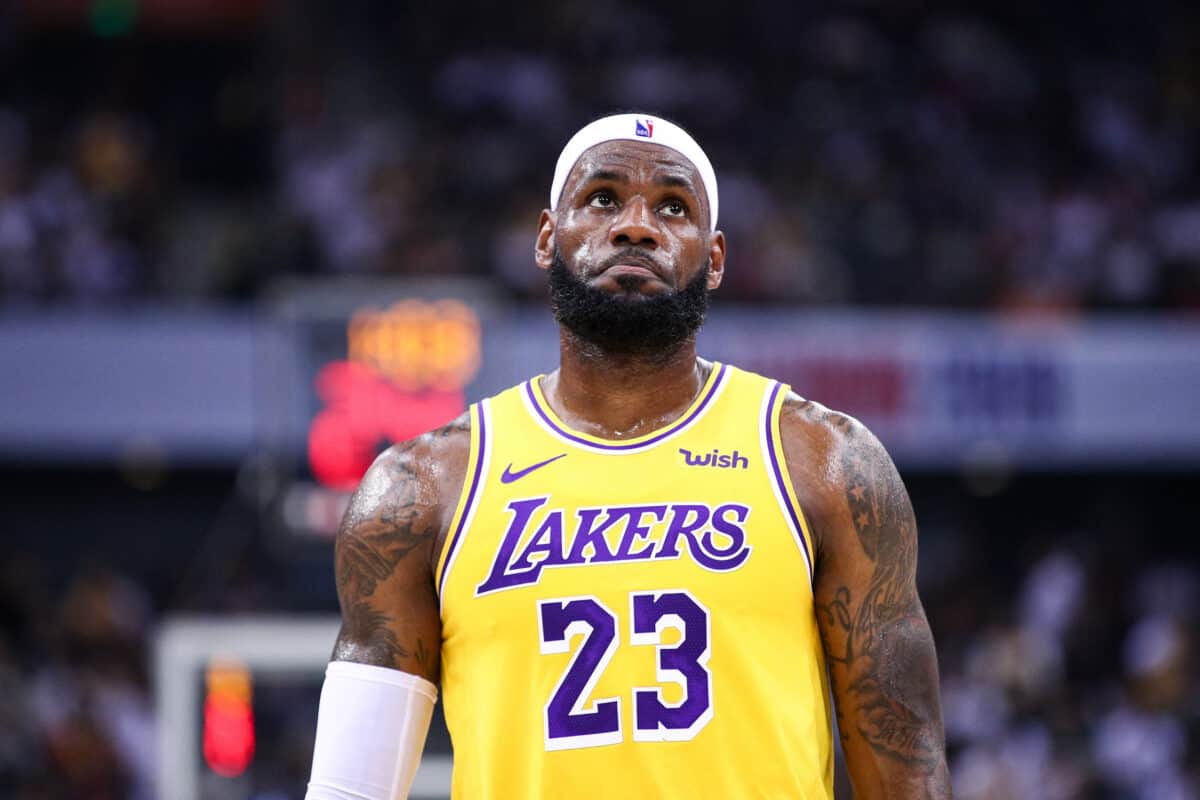
When you look at a Lakers uniform, you know that it’s a Lakers uniform. Their bright yellow shirts and shorts with purple facings are resplendent and individual. This color scheme is bold and daring. While it’s definitely in-your-face, it doesn’t look cheap.

Mandatory Credit: NBC Sports

Sure, the superstars who’ve worn it over the decades like Kareem Abdul-Jabbar, Shaquille O’Neal, Kobe Bryant, and LeBron James give it a heightened sense of worth. But if uniforms had voices, then this one would be a leader of men because it’s just so powerful.

Mandatory Credit: USA TODAY Sports

6. Bad – Cincinnati Bengals

Part of us respects the Bengals because they’re doing something different. But sometimes people avoid doing something for a reason. Shamelessly emblazoning your helmet with bright orange and black stripes is one of these things. It’s just too garish.

Mandatory Credit: USA TODAY Sports

Orange can work but it’s all about how you use it. The shade is important too and the Bengals’ are just too bright. The black is a strong contrast and it’s all just too overpowering. In sum, it reeks of ’90s design and needs to be refreshed. There is a way to make the Bengals’ style work, but not this way.

Mandatory Credit: USA TODAY Sports

5. Great – Texas Longhorns

Another great college program on this list, the Longhorns have one of the best uniforms in football period. In fact, it’s almost a shame they’re an NCAA team and not an NFL franchise because this is truly one of the greatest out there. Firstly, the Longhorn badge is fantastic. An indigenous and cool animal, it looks great on their helmets.

Mandatory Credit: USA TODAY Sports

We saw with the Bengals how atrocious orange can be if you do it wrong. But the Longhorns go a couple of shades paler and balance it with white instead of black. It’s clean, timeless, and distinctive. In sum, you can’t ask for more than that. An inspired color scheme.

Mandatory Credit: USA TODAY Sports

4. Bad – Seattle Seahawks

The Seahawks are like marmite. Some people will love the Seattle franchise’s color schemes, while others loathe them. The notorious ‘color rush’ is one example of them going all-out with their self-described ‘action green.’ While they gain points for trying to be modern and different, they also lose them for coming up with some rubbish designs. Seattle’s uniforms lack the same legacy factor as the likes of Pittsburgh.

Mandatory Credit: USA TODAY Sports

In fact, it often feels like they don’t know what they’re trying to achieve with them. They might have one of the league’s best quarterbacks in Russell Wilson, but they don’t know how to dress him properly. In recent times, they’ve worn navy, grey, green, and white. It’s as though they asked a fish to use every color that it knew. In sum, they really don’t have the nicest uniforms in sports.

Mandatory Credit: USA TODAY Sports

3. Great – Notre Dame Fighting Irish

The Fighting Irish are on this list for their classic color block, not for any weird Adidas interpretations. When it comes to iconic uniforms, Notre Dame are up there with the best of them. Their iconic gold helmets immediately stand out, while their navy jerseys have a clean look to them. They possess a timeless look. While the technology and fit of the materials may change, the overall aesthetic is untouchable.

Mandatory Credit: USA TODAY Sports

We’ve seen uniform manufacturers try to be original with pinstripes and bizarre helmet modifications. The simple thing to do is nothing. This is because it is pointless trying to fix something when it isn’t broken. The Fighting Irish know what they expect from a uniform because they have one of the very best. This represents tradition, legacy, and achievement in one stunning design.

Mandatory Credit: USA TODAY Sports

2. Bad – Anaheim Ducks

Our problem with the Ducks stems from their logo. They decided to modernize their uniforms and in doing so lost some of their soul. We miss their old badge because it was fun and distinctive. This is a franchise that emerged from a Disney movie, so there’s nothing wrong with keeping to that character.

Mandatory Credit: Bleacher Report

Now they have a webbed foot on their uniforms. Yes, they’re trying to move the franchise into the twenty-first century, but you shouldn’t throw away what made you special and unique at the same time. It’s definitely the worst in the league and really damages their uniforms.

Mandatory Credit: USA TODAY Sports

1. Great – New Orleans Saints

For our money, the Saints have the best uniforms in US sports today. Their black and gold is quite simply regal in appearance. Add in the Fleur de Lis and you’ve got something truly special. The latter detail is one of the classiest logos in all of US sports. Just compare that to the Browns’  helmet.

Mandatory Credit: USA TODAY Sports

Meanwhile, they use a paler shade of gold than the Steelers so it’s automatically recognizable. It is also a more metallic shade so the players look like they are wearing gold. Meanwhile, they get bonus points for their ‘color rush’ uniform which is a perfect contrast to the black.

Advertisement